


MaaS is portal which combine car rental, carsharing and taxi alternatives around the world. As an alternative car portal MaaS is suitable for companies and employees with our flexible budget assignment and leasing downsize. In intuitive and usable way the landing page explain what is the portal about and how can be used.


Brand new experience - MaaS by Sixt
The landing page consist of five sections of information with clear focus on the content. The layout is flexible enough to be used in any device. With the help of clear user experience, big typography, high quality images and delight interactions I was able to build a beautiful and delightful landing pages. The prototype shows the whole landing page interface flow. The transitions and the macro animations enhance the usability of the page and bring delight into the usage. They help the users to focus on the interactive ux elements and guide them to accomplish their goals.
Create an UX/UI interface for responsive landing page, which explain what is mobility budget by Sixt and how it can used. I apply a user centred design approach meanwhile designing the interface. Previously I was also in charge of creating the whole MaaS portal, but because of legal reasons I can't share with you.
What is the user group? What is the product? What is the problem? What are the goals?
I have different meeting with stakeholders and programmers.
My first steps were to structure the primary information from the secondary and to focus on the crutial points such as "What are the use case" in which the platform can be used, how exactly the budget can be splitted, giving some examplary usage and focusing on real customer and what is their experience using our platform.
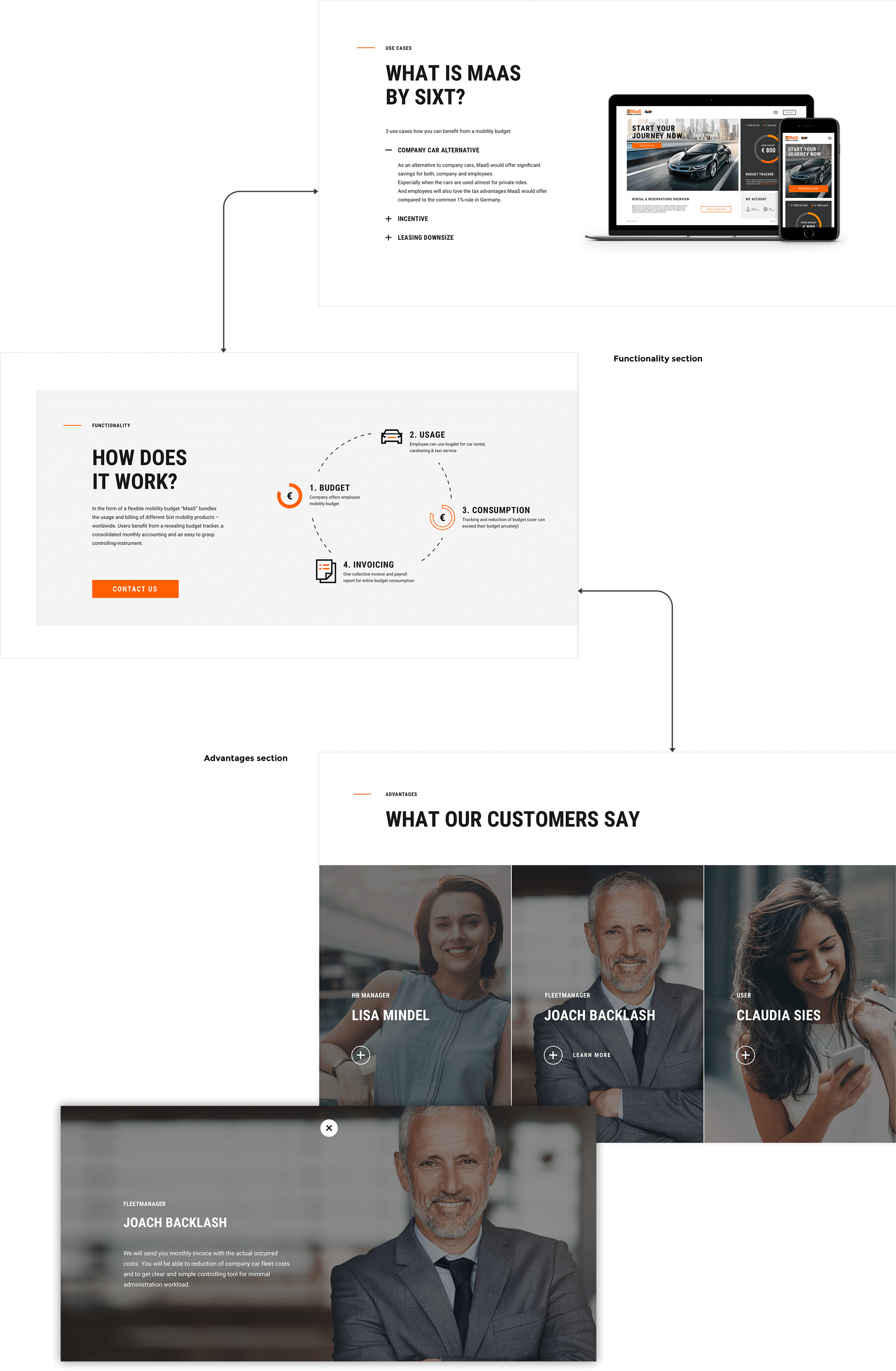
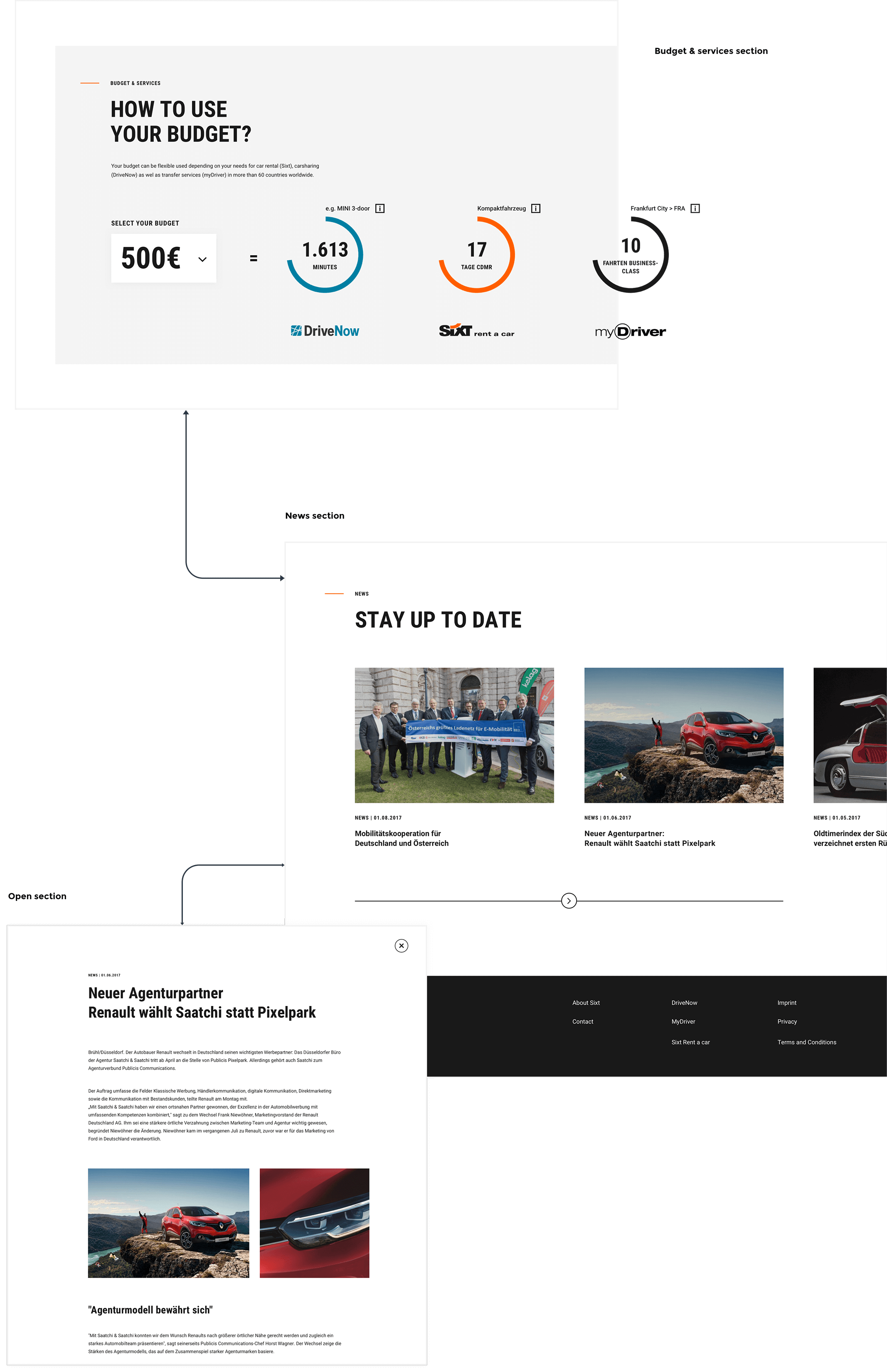
The outcome was the following: Four main sections which explain the following main use cases of the portal: How does it work; What are the advantages; What our customers say about us; How can be use the budget and Stay up to date - a news section.
Collaborate and build relationships: users, stakeholders, devs.
Create detailed documentation which shows each part of the design process. Starting with the following goals:
Create..
a landing page which explain how the MaaS portal works
For...
business customers and their employees
To...
clear idea how the flexible mobility budget works and how can be used.
And improve...
the branding and create a clear overview what is the MaaS portal and increase successful the number of customers using the portal
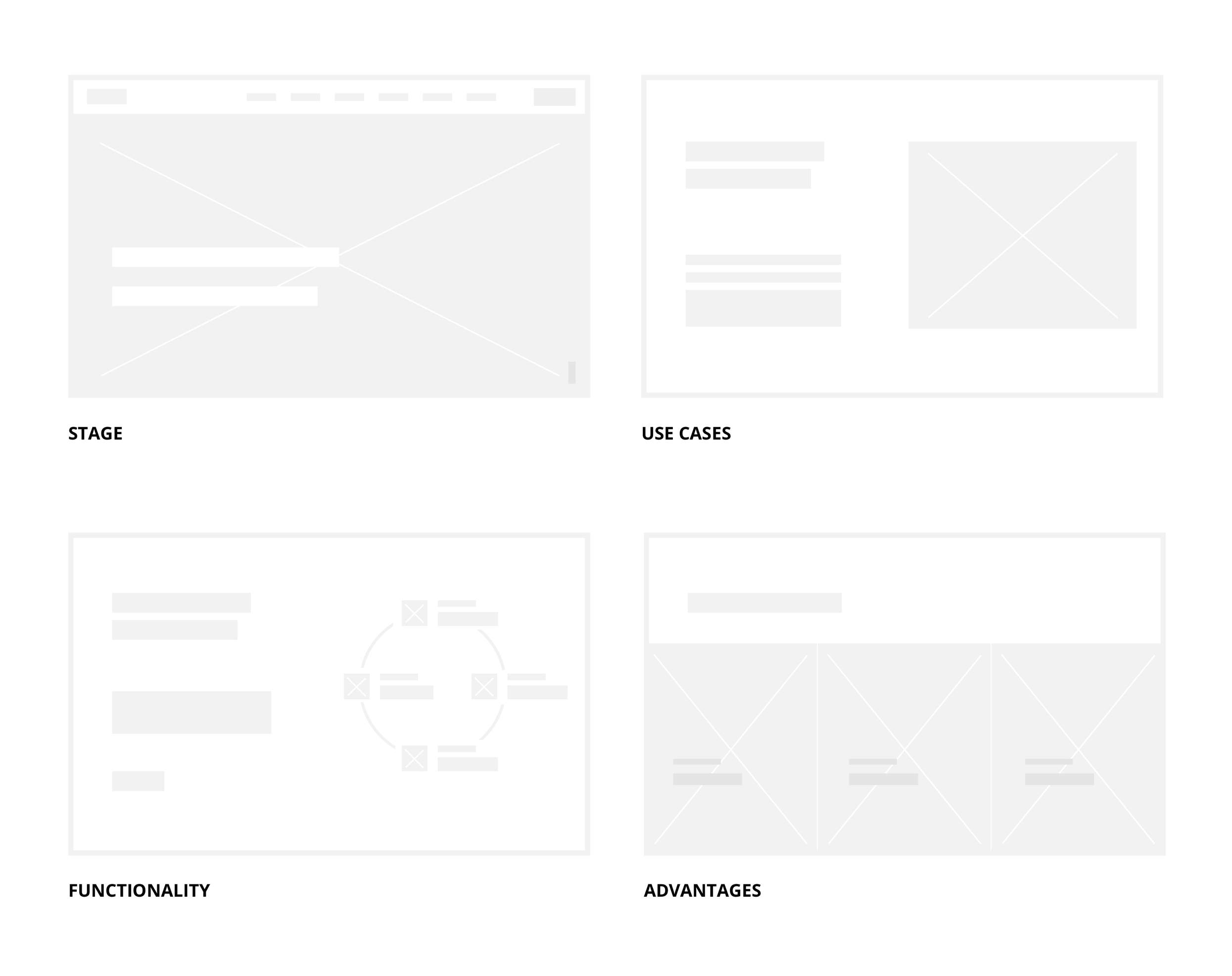
3. Low Fidelity Design.
I choose a layout that would allow me to keep the focus on the primary information, while also maintaining a balance with the rest of the content.
4. High Fidelity Design.
Each section explain different part of the MaaS platform.
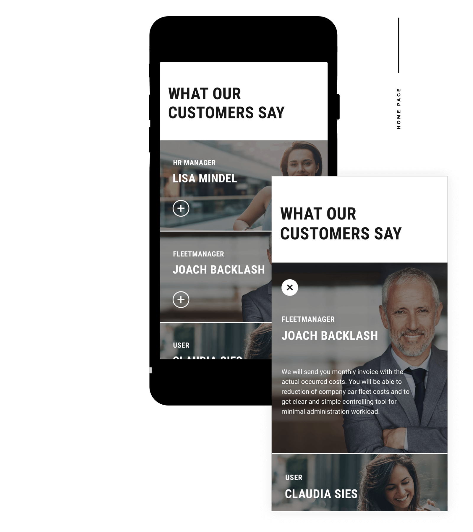
Mobile home page, testimonials
Mobile Flow
The mobile flow is created in a way that the user can easily access and focus on each section even in a small device. I order to reduce complexity on the screen and keep the focus on the primary content I decided to hide some of the secondary information instantly and to show it as out of canvas. The clean and minimal design create a smooth user experience though the whole mobile interface.
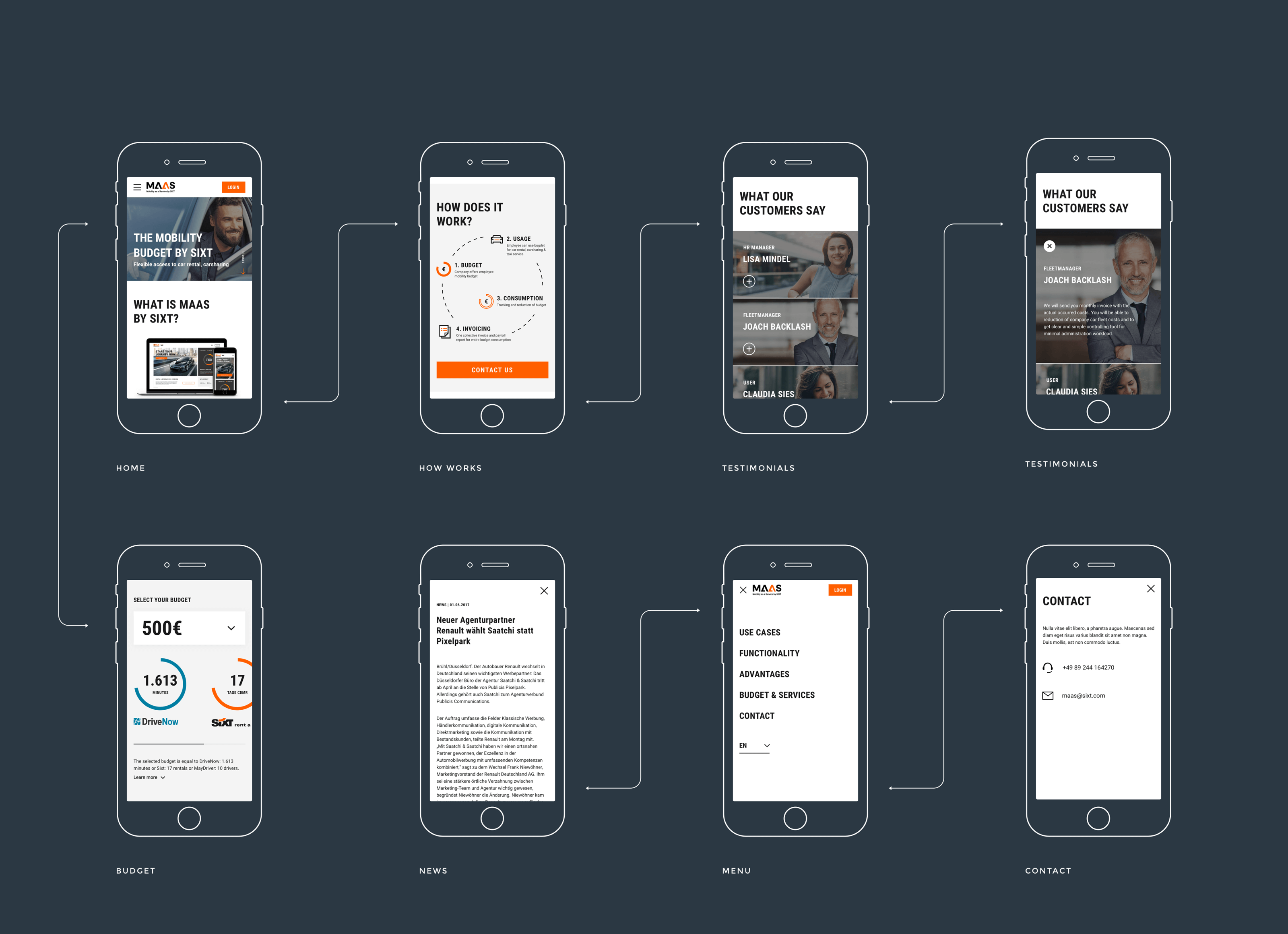
Mobile Prototype
The prototype shows the whole mobile interface flow. I have used different macro animation which enhance the interactive elements or scrolling events. All the transitions are made in a way that they can give a direct feedback to the user that something have changed and what is the exact trigger point. In addition I decided to use as well loading transition which can help the user to focus on the upcoming section in the visible area.
Provide pricise asset, Zeplin project, Invision prototypes and flow diagrams for accurate implementation.
Taking part of implementation process, quality control for each deploy steps.


