


Zelenika is an attractive bio store for healthy products and recipes, which emphasise the important of the healthy eating. The project consist of UX, UI interface and Interaction concept.


Create an web UX/UI interface for bio store. Create a new logo and new brand look. I apply a user centred design approach into the new design for the bio store.
What is the user group? What is the product? What is the problem? What are the goals?
I made a research of the current market and competitors, focusing on what is missing in the already excisting solutions and with what the new bio store will be better than the alternatives.
The outcome was the following: The users want more detailed information about the products, why they are biological and what is the advatange of using them. They are missing advices what they can do with those bio heatly products and how to combine the healty eating with a delitious flavor.
Collaborate and build relationships: users, stakeholders, devs
Create detailed documentation which shows each part of the design process. Starting with the following goals:
Create..
a better bio store focusing on the product ingredients
For...
users from 10 to 75 years old
To...
easy and usable access to the product assortment and all additional tips and informations
And improve...
the branding and create smooth and delightful user experience and increase successful completion of orders
3. Low Fidelity Design.
The usability is made in a way that the users can easily concentrate on the content and interact with the interface. For each step/page the user is leaded to achieve one primary goal.
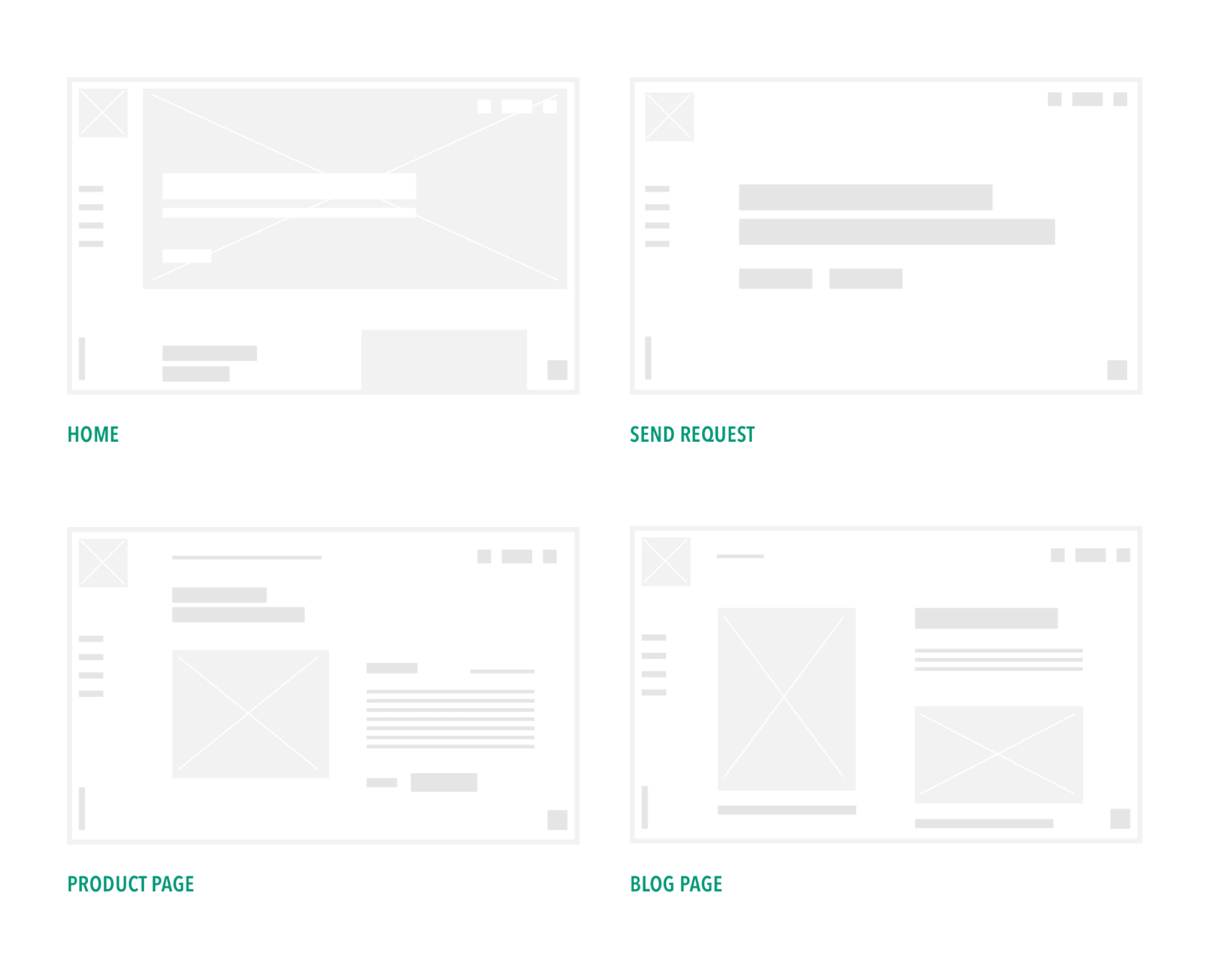
Where possible taking part in testing lab or A/B Testing.
I have always been a huge fen of healthy eating, so I was looking for a way to share this passion with the users. I figured out that focusing on the freshness of the initial product ingredients will make the difference compare with the available already bio stores. The high fidelity design includes Invision prototypes and Interaction concepts.
Desktop Prototype
The prototype shows the whole desktop interface flow. The transitions and the macro animations enhance the usability of the store and bring delight into the usage. They help the users to focus on the interactive ux elements and guide them to accomplish their goals.
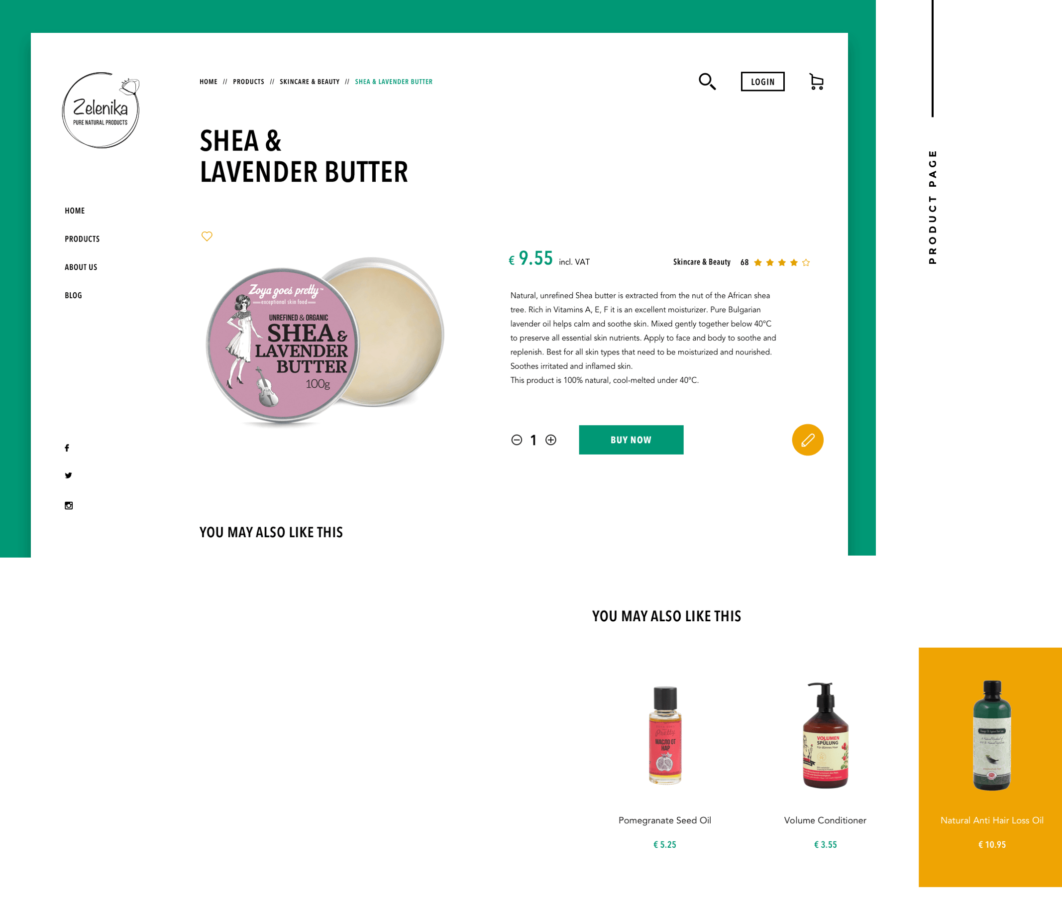
Product Page.
I choose a layout that would allow me to show the products prominently, while also maintaining a balance with the rest of the content.
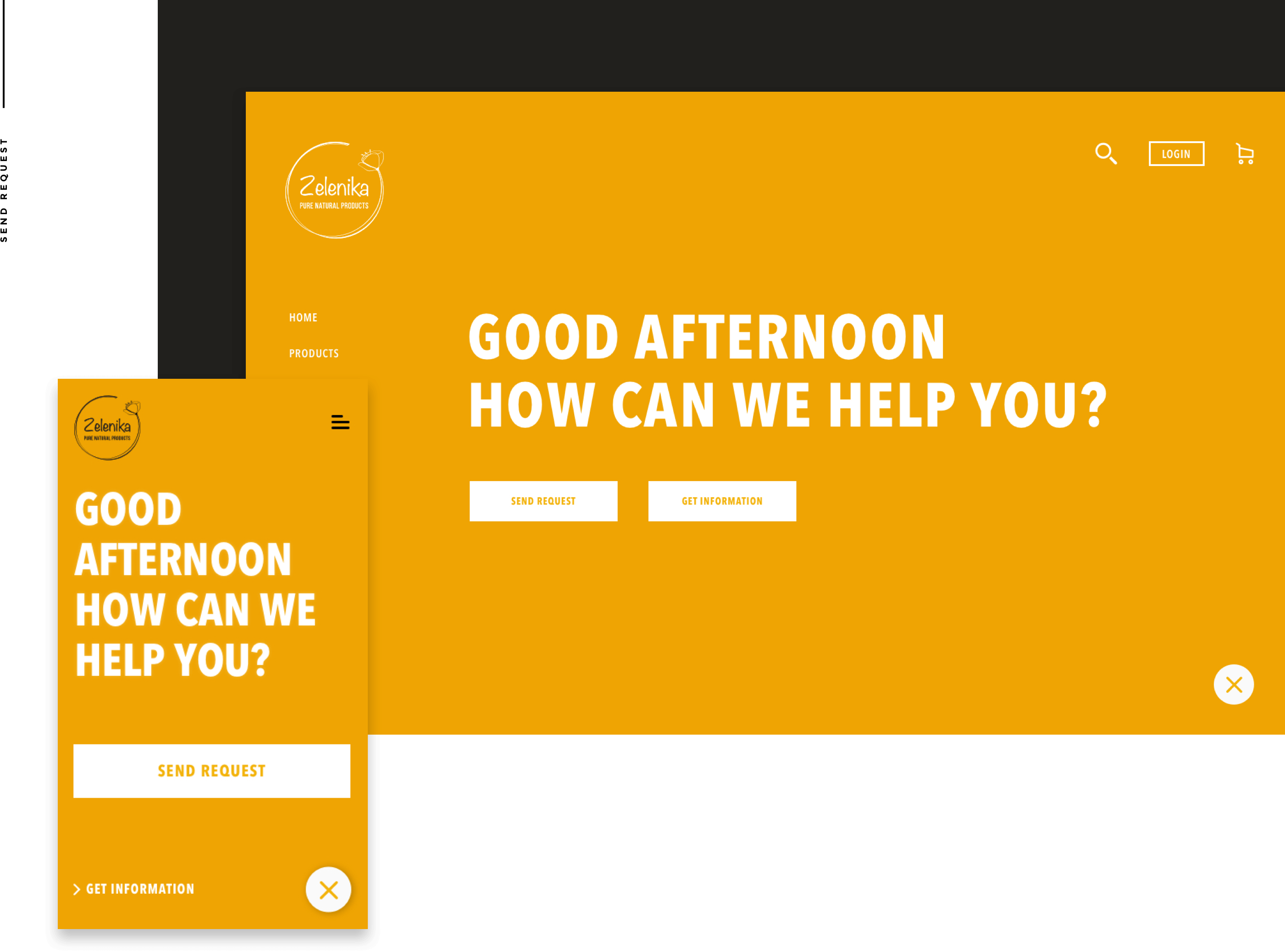
Do you still have questions?
A fast request form can be accessed anytime through the whole interface. This will help the user to request information for certain products or to contact the customer service.
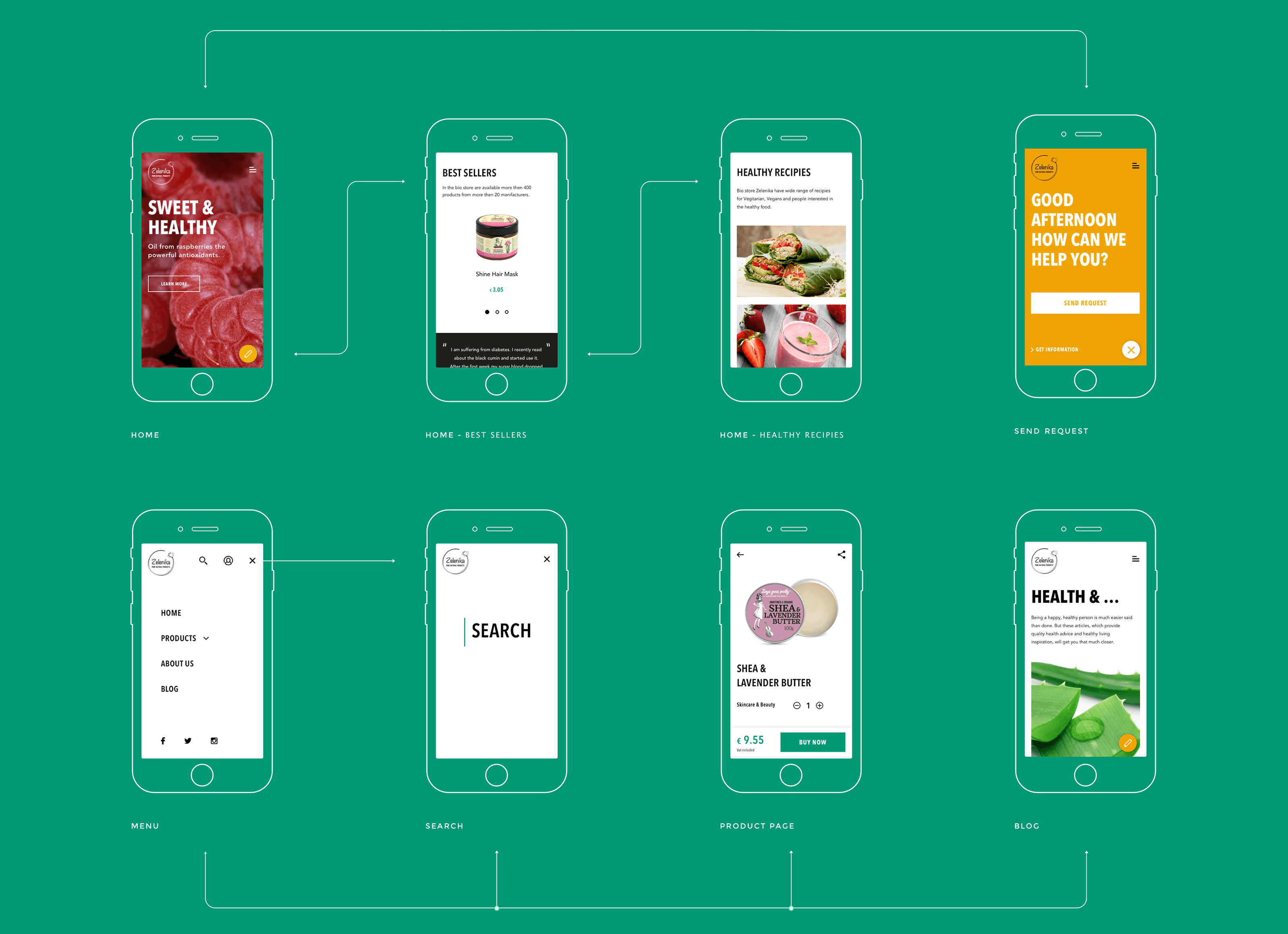
Mobile Flow
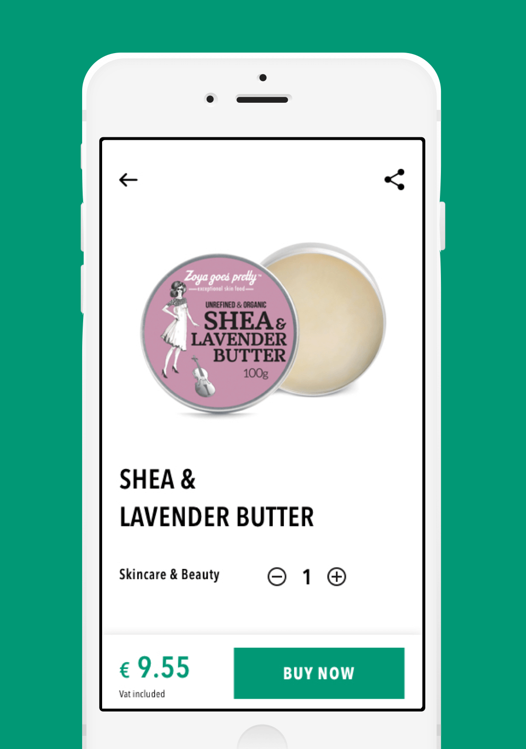
The mobile flow is created in a way that the user can easily access and focus on each section even in a small device. I order to reduce complexity on the screen and keep the focus on the primary elements I decided to present some of the modules as out of canvas. The clean and minimal design create a smooth user experience though the whole mobile interface.
Be inform anytime!
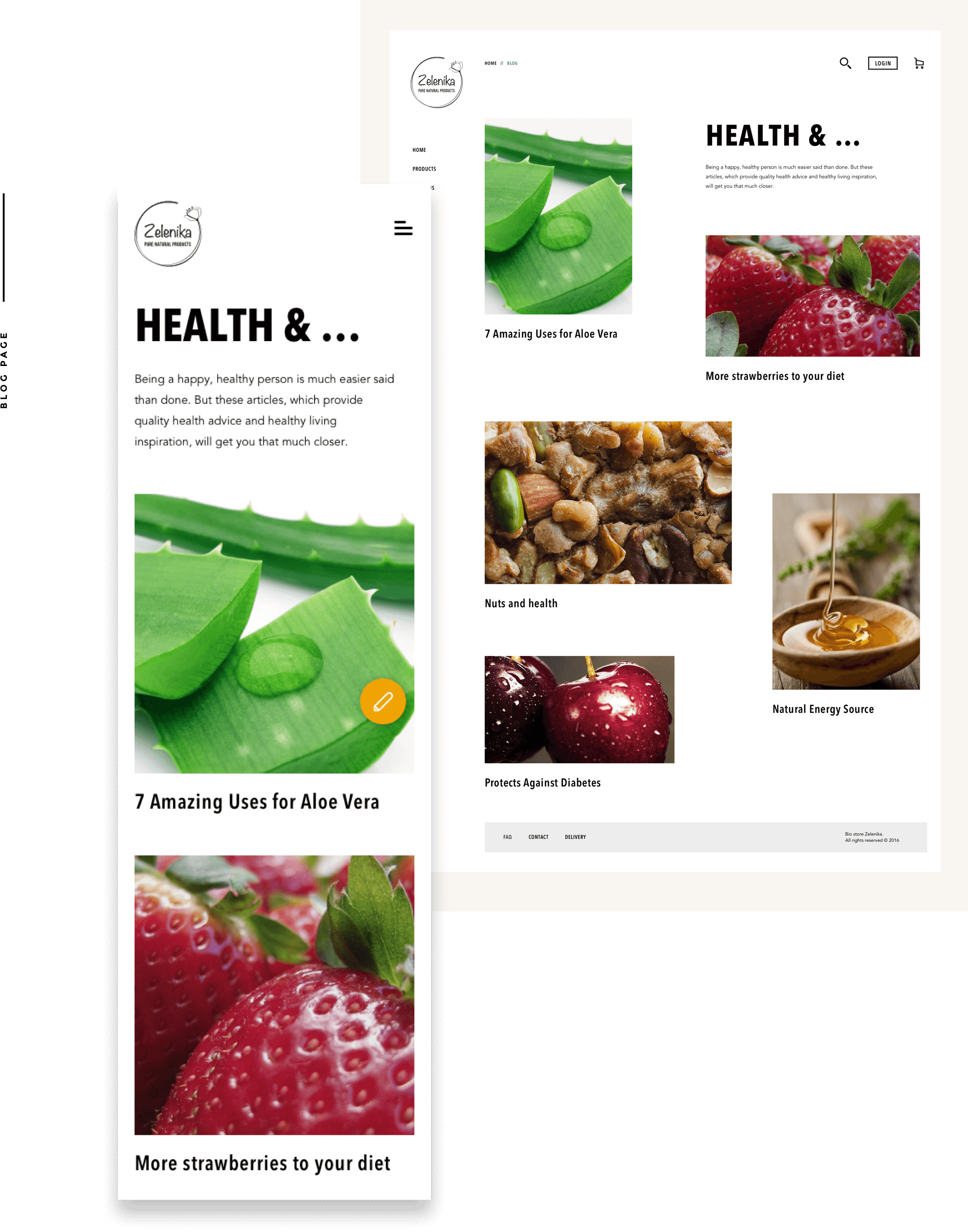
I have created a blog page where the users can receive an useful information about the healthy eating and some interesting vegan and vegetarian recipes.
Provide pricise asset, Zeplin project, Invision prototypes and flow diagrams for accurate implementation.
Taking part of implementation process, quality control for each deploy steps.


